Stabilitas is a leading AI-driven intelligence platform designed to help organizations stay informed about critical events that could affect their operations, teams, and locations. However, their existing platform faced a major usability problem: a cluttered interface that made it difficult for users to quickly identify high-priority events among a sea of data. Users were missing key alerts, which led to delayed reactions during critical incidents.
Key Challenge
The platform lacked a clear content hierarchy, causing critical information to be buried under less important alerts. This clutter not only slowed down decision-making but also increased user frustration during high-stress situations.
2. User and Business Goals (The "Jobs to Be Done")
By applying the Jobs to be Done (JTBD) framework, I identified four core jobs that the platform needed to help users complete:
Prioritize Critical Events: Users needed a way to quickly spot and act on the most urgent global events.
Navigate Information Efficiently: The interface had to be intuitive, making it easy for users to sift through complex data without feeling overwhelmed.
React to Urgent Situations in Real-Time: Users had to immediately identify and respond to critical alerts to mitigate risks.
Make Confident, Informed Decisions: Users needed to trust the platform’s ability to present timely and relevant information, even under pressure.
For Stabilitas, achieving these goals meant empowering users to respond more quickly and confidently to incidents, ultimately improving business performance and enhancing customer retention.
3. Design and Strategy Approach (How I Solved It)
As the lead designer, I approached the problem by focusing on simplifying the interface and creating a clearer flow of information. Here’s how I addressed the core challenges:
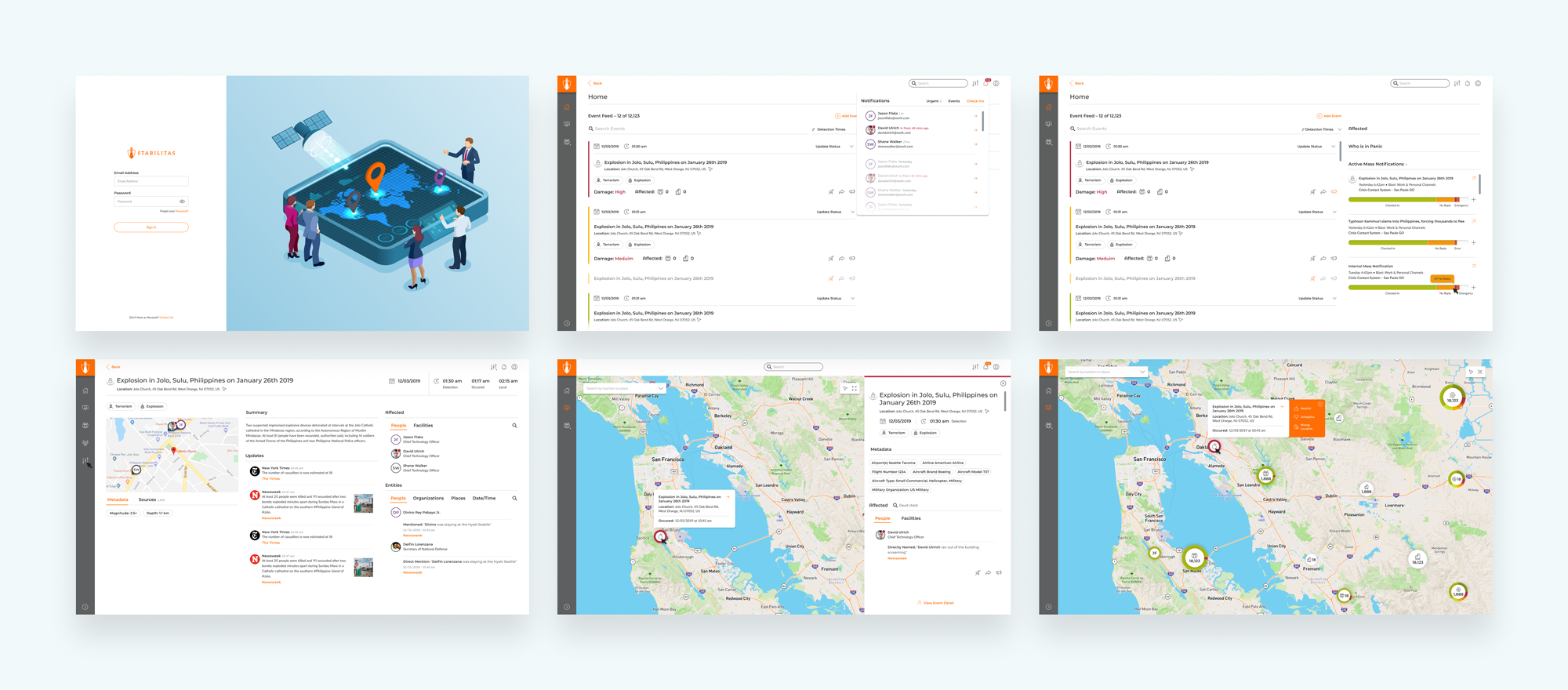
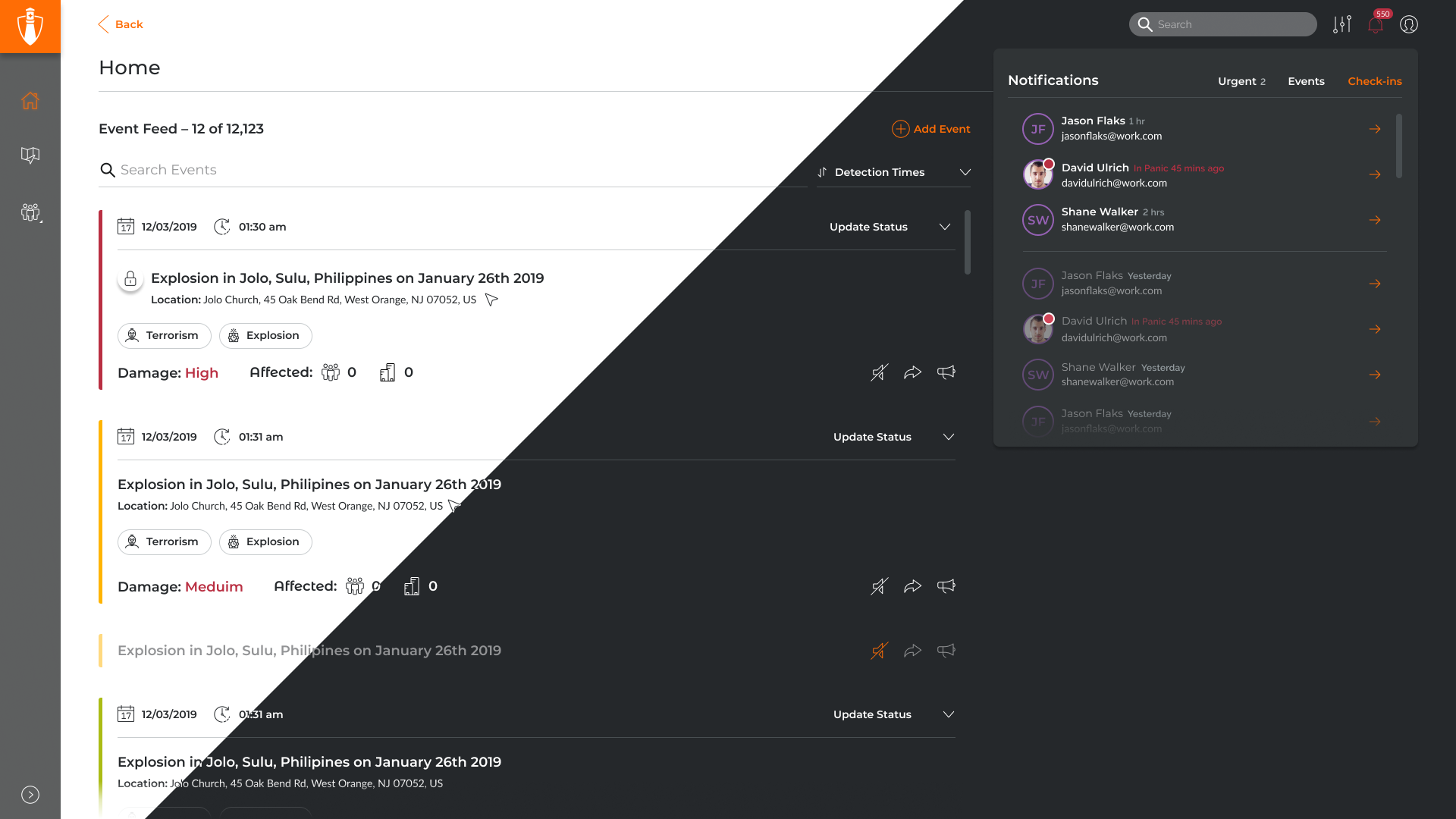
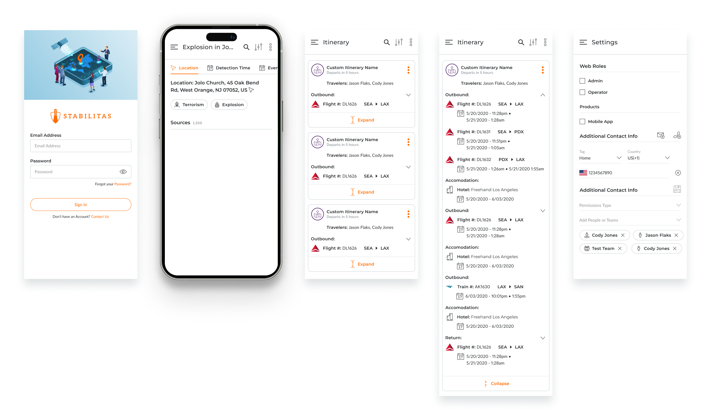
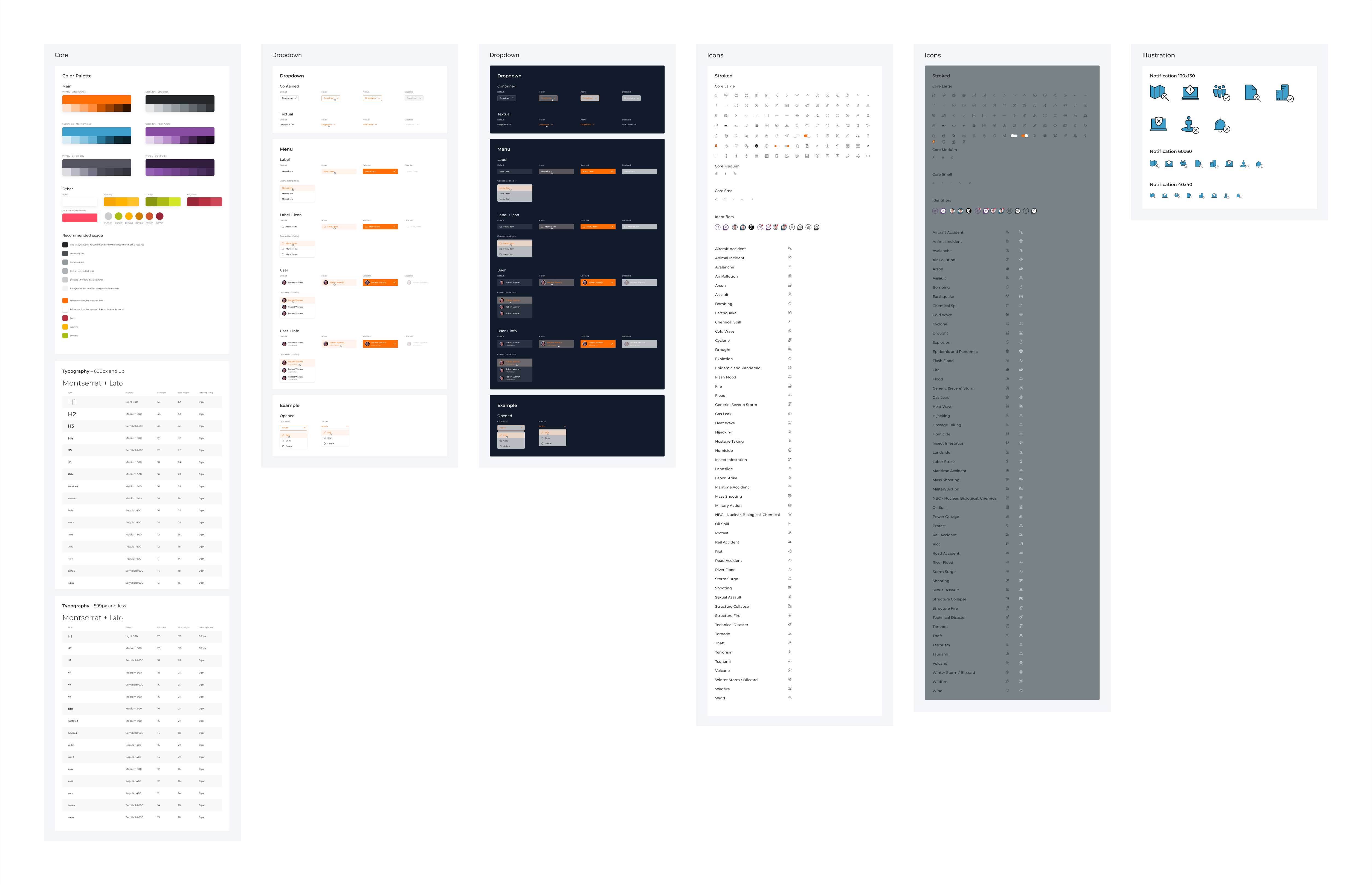
Reworked Content Hierarchy: I redefined the platform’s information architecture to clearly distinguish between primary, secondary, and tertiary data. I worked closely with the development team to ensure the most critical events were prominently displayed, while still allowing users to access less urgent but still important information without it being a distraction. This was done through visual hierarchy, grouping related data, and making key events more visually distinct.
Iterative Design with Real-World Testing: After creating wireframes, I built interactive prototypes to test different layouts and information flows. This allowed for real-time user feedback and adjustments. I ran usability testing with actual users to ensure the new interface solved the primary pain points while also being intuitive and fast.
Visual State Design: One of the key design decisions was the creation of three visual states—passive, attention, and alert—to communicate the urgency of an event. This helped users easily distinguish between data they could defer and data they needed to act on immediately. The design was rigorous and tested to ensure it didn’t cause confusion or fatigue.
Collaboration with Cross-Functional Teams: To ensure alignment with business goals and technical feasibility, I worked closely with the product and engineering teams. We refined the design together to ensure it met both the user needs and technical constraints while remaining scalable for future updates.
4. Impact (The Results)
The redesigned Stabilitas 2.0 platform successfully addressed the core usability issues, leading to a more intuitive and efficient user experience. The key outcomes were:
User Satisfaction: Post-launch user surveys showed a 30% increase in user satisfaction, with feedback highlighting the clarity of the new alert system and the ease of navigating urgent information.
Faster Decision-Making: By prioritizing information more effectively, users were able to make decisions 40% faster during critical incidents.
Business Success: The improved user experience played a crucial role in Stabilitas’ acquisition by OnSolve. The streamlined interface and better prioritization of events positioned Stabilitas as a leader in the critical event management space, giving it a competitive edge in the market.
5. Reflection & Learnings (What I Took Away)
This project reinforced the importance of balancing simplicity with data depth. While it’s essential to prioritize key information, it’s equally important to allow users to access secondary data without feeling overwhelmed. I learned the value of real-time user testing and iteration to ensure that the final design met both user needs and business objectives.
In future projects, I would focus even more on integrating micro-interactions that further guide the user’s attention and reduce cognitive overload. Additionally, working closely with product teams early in the process ensures that the design is not just aesthetically pleasing but also strategically sound.
Product Overview:
Stabilitas 2.0 is an AI-powered intelligence platform that offers comprehensive situational awareness and critical event management capabilities. The redesigned platform ensures that users can quickly identify, act on, and resolve critical incidents, helping organizations protect their teams and assets, no matter where they are in the world.